

Be the Color: creating a logo and window graphics for an immersive art exhibition
My friend and client Adam Havrilla of Havrilla Designs recently commissioned me to create a logo and system of window graphics for his storefront floral studio in Chicago’s Ravenswood neighborhood. He is converting his studio into an exhibition space, and creating an immersive art experience there in August. In Be the Color, attendees will use flashlights to reveal the color of objects and assemblages that are otherwise lit with yellow light, which saps them of their natural hues.
The window decals were to serve two purposes: 1) to establish an elegant and intriguing brand that would entice people to attend, and 2) to fully darken the interior space from outside light to facilitate the interactive nature of the installation. This was no small feat, considering that his studio is contained on the street side by banks of nearly floor-to-ceiling windows, as well as glass doors. An optional bonus function would be to provide a backdrop for selfies or portraits of attendees.
Item #1: Custom logo design for an art exhibit
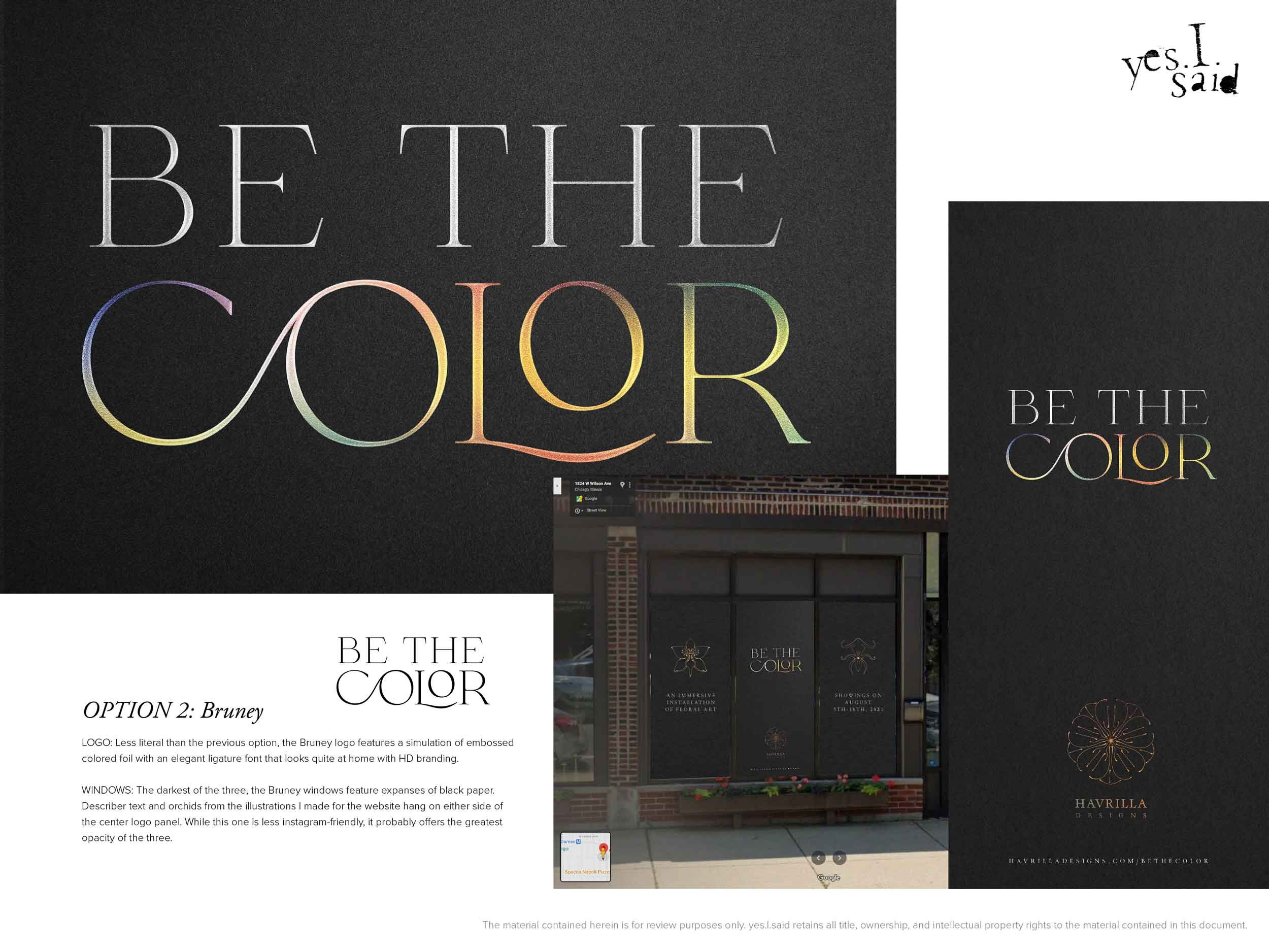
I began by presenting Adam with three options for a Be the Color wordmark. I envisioned that any of the eventual logos would be colorful wordmarks over a dark background, in order to maximize the opacity/darkening properties of the eventual window decal designs. I presented each wordmark in color on a textured black background, on its own as a black shape, and in the context of a mock-up of one of the two three-window displays that comprise the majority of his storefront.
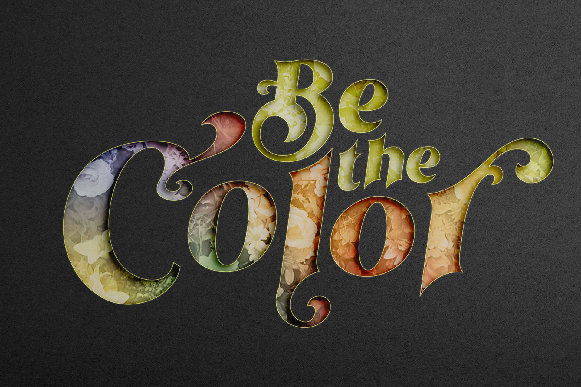

OPTION 1: Othelie

LOGO: Features a fun, hand-lettered display typeface. In full-color, ‘Be the’ represents the yellow light used in the exhibit, and ‘Color’ uses a gradient derived from Havrilla Designs brand colors over a floral background.
WINDOWS: The cut-out effect of the logo reveals a gradient floral background that is displayed unobstructed on either side of the center informational panel. This design would be a great backdrop for insta portraits by attendees of the exhibition.
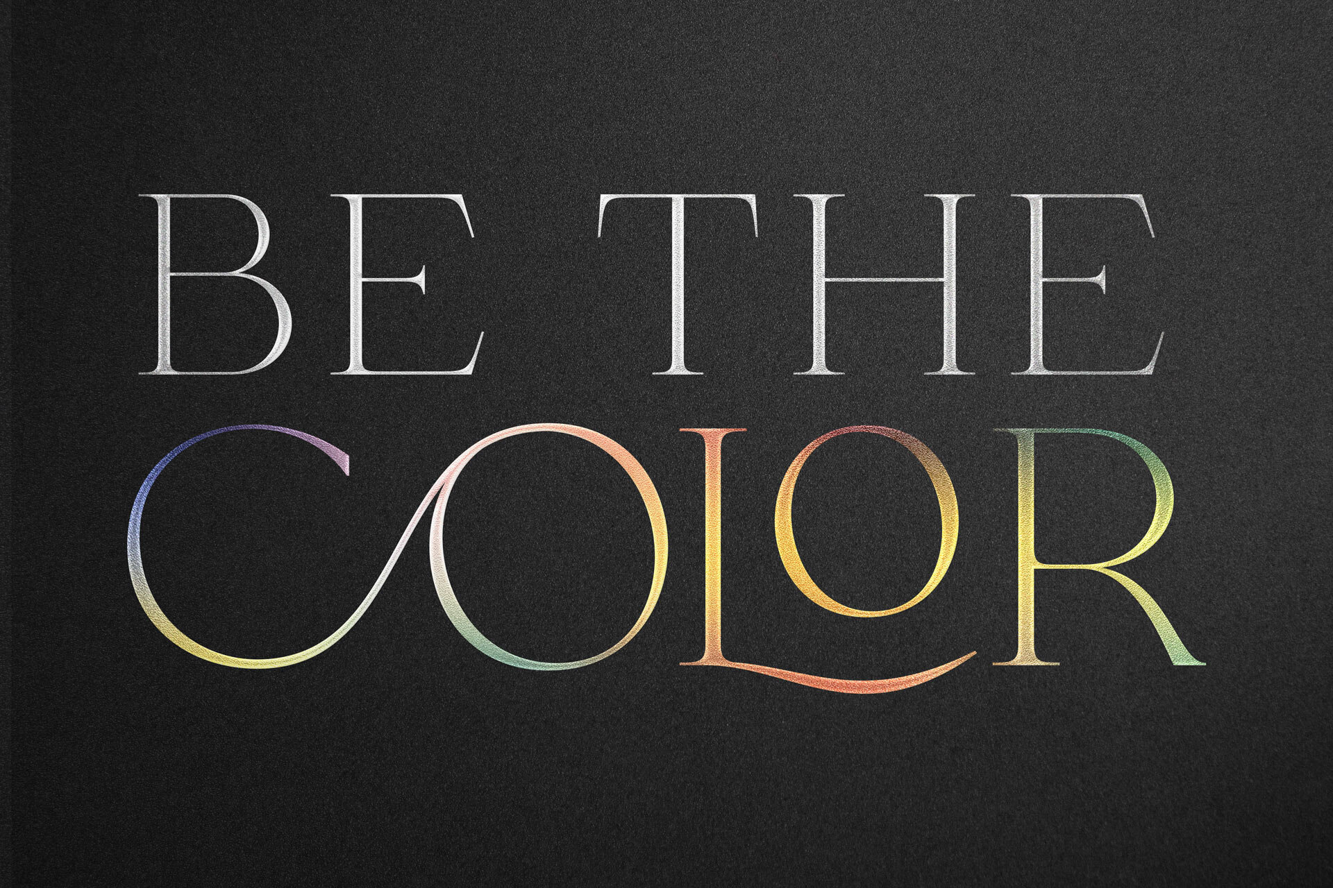
✓ OPTION 2: Bruney

LOGO: Less literal than the previous option, the Bruney logo features a simulation of embossed colored foil with an elegant ligature font that looks quite at home with Havrilla Designs branding.
WINDOWS: The darkest of the three, the Bruney windows feature expanses of black paper. Describer text and orchids from the illustrations I made for the Havrilla Designs website hang on either side of the center logo panel. While this one is less Instagram-friendly, it probably offers the greatest opacity of the three.
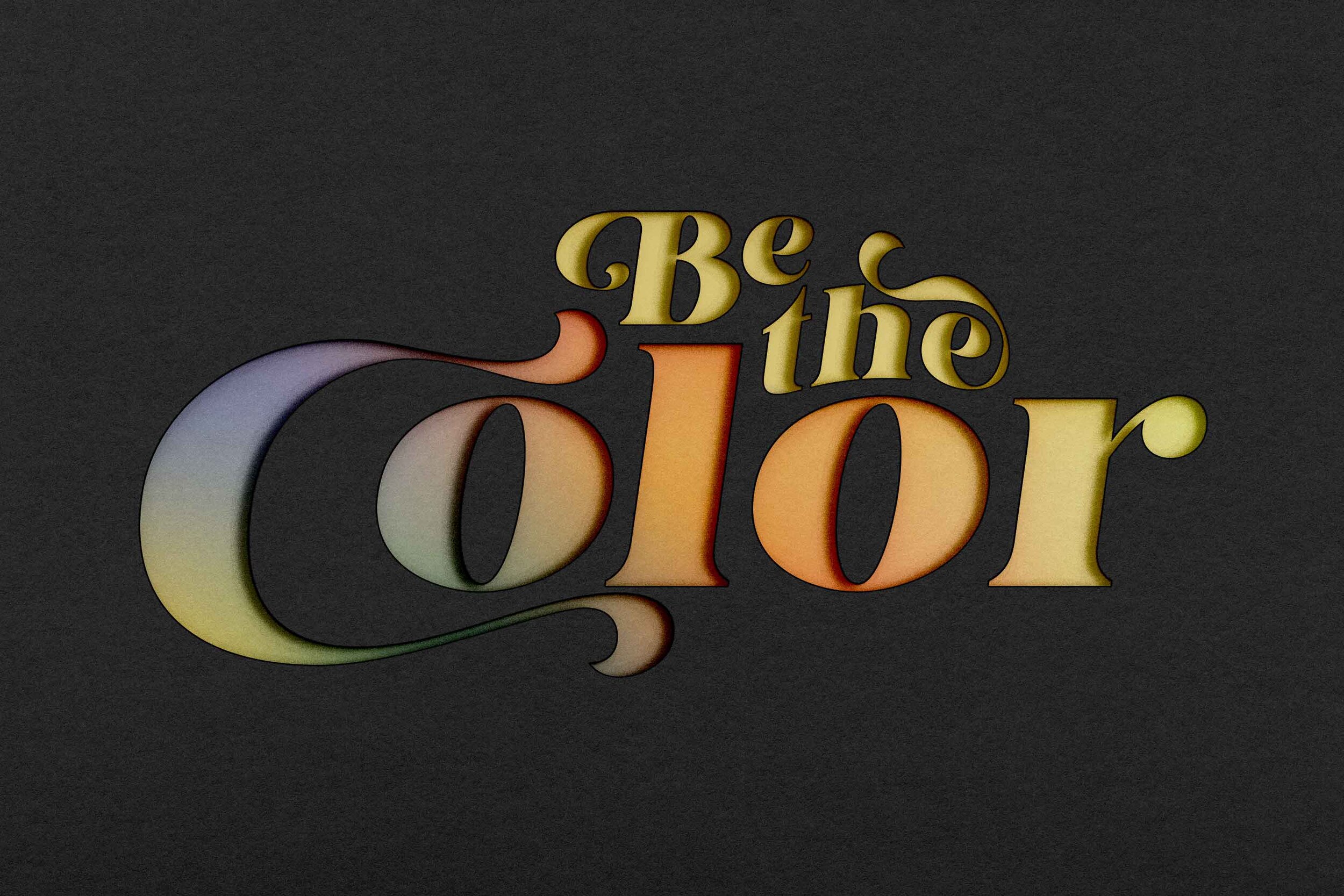
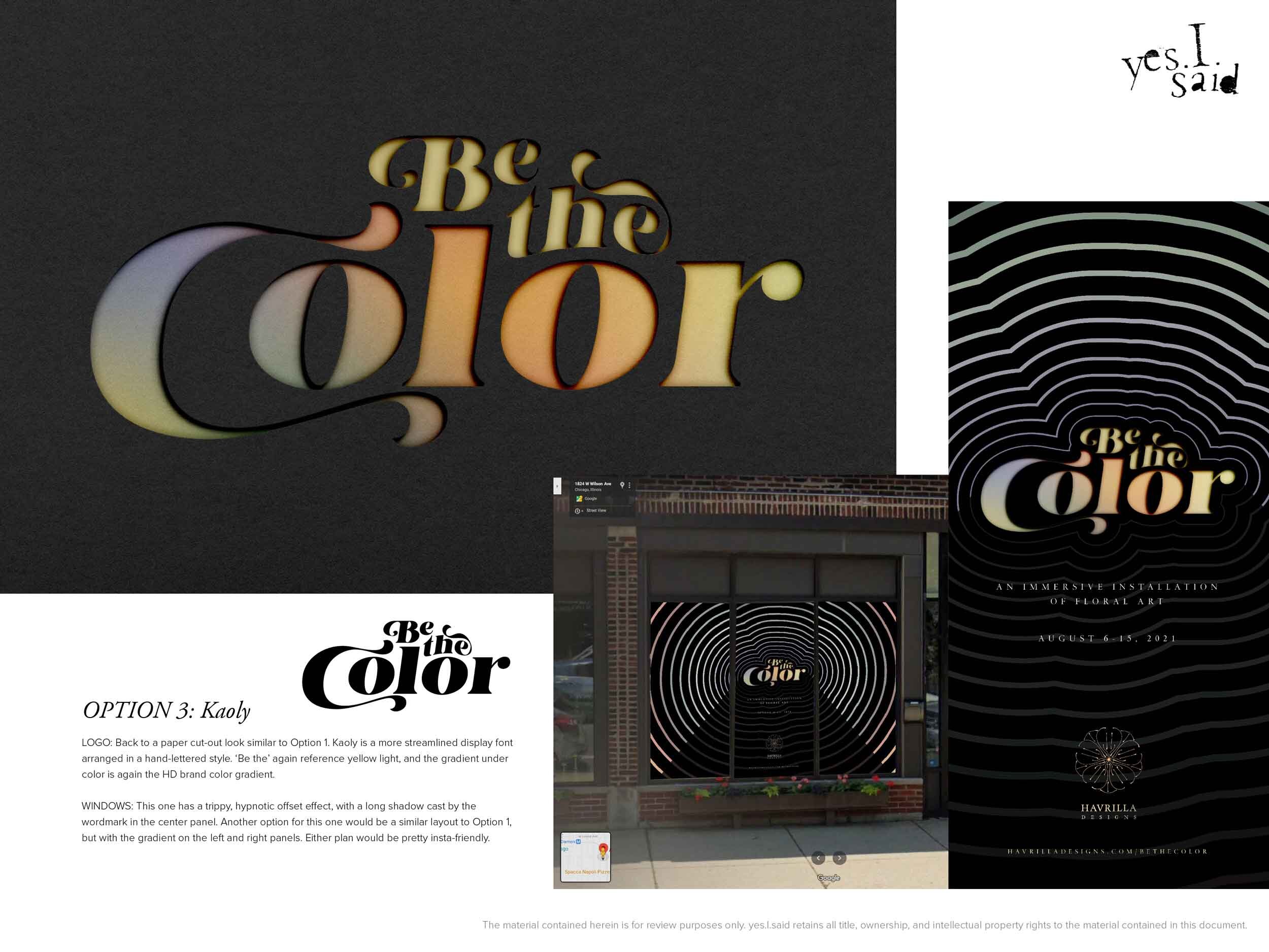
OPTION 3: Kaoly

LOGO: Kaoly is a more streamlined display font arranged in a hand-lettered style. In the color version, ‘Be the’ again references yellow light, and the gradient under ‘Color’ is again the HD brand color gradient.
WINDOWS: This design has a trippy, hypnotic offset effect, with a long shadow cast by the wordmark in the center panel. Another option for this one would be a similar layout to Option 1, but with the gradient on the left and right panels. Either plan would be pretty insta-friendly.
Adam came back almost immediately saying he loved Option 2 and how aligned it was with his existing branding. He was worried, though, that the window displays wouldn’t have the necessary visual impact. I was, as yet, nowhere near 100% thrilled with the window design, so I went back to the drawing board to devise a more impactful display.
Item #2: Custom window graphics for storefront windows and doors
The mock-up I submitted with the Bruney logo, while pleasing in its minimalism and elegance, had a few major problems: 1) it had very little impact on the street; 2) it didn’t take sufficient advantage of the giant amount of real estate available on those windows to make a grand statement; and 3) it didn’t have much appeal as a backdrop to a social selfie. I quickly decided to eliminate the illustrations I made for the Havrilla Designs website; but what to put in their place?
I began with two options: one with a dark center panel and a bright, saturated gradient on either side, definitely suitable as a photo backdrop; and a second that featured the logo spread across each three-window group on the storefront. The complexity of those groupings and structural dividers between each window presented two not entirely satisfactory choices: do we go for legibility and logo integrity and keep the logo’s max size the width of a single window? Or, do we go for impact at a distance and allow the logo to span each three-window set — even if that meant interrupting the logo’s form continuity with the window dividers?

Window design mock-up #1: gradient panels
Window design mock-up #2: large logo
Both of these solutions addressed most of the issues presented by the initial Bruney mock-up; they both had more graphic impact and visual appeal from a distance and would work better as a selfie background. Adam suggested we could find a way to incorporate the brand’s floral illustrations, perhaps in an enlarged partial view. I was still worried that I was squandering an opportunity to take advantage of the size and prominence of the storefront with a more elaborate artistic statement, so I took Adam’s prompt and went back to the drawing board.
Back when I created the floral illustrations, I had designed a custom Illustrator brush to ensure consistency in the style of the strokes. Using that brush, I began to sketch out a more graphic idea for all new artwork. In it, flowing, almost Art Deco lines with round caps, variable width, and gradient strokes evoke the contours of orchids and other tropical blooms. This idea was a home run, as far as Adam was concerned.

Mock-up: Be the Color window displays

Mock-up: Be the Color side door and window designs
Final steps: printing and installing the window graphics
After some drama caused by a number of miscommunications on the part of UPS and the wholesale printing service that fabricated the decals, Adam finally received the window graphics and installed them with the help of his handy husband. He was over the moon with the result, and is currently putting the finishing touches on his installation.
Here are some photos and an Instagram video that Adam took during installation. (For some reason, these Instagram embeds aren’t loading consistently; if the posts aren’t loading, you can click through to the posts on Instagram, or try reloading this page.)


If you are in the Chicago area this August, check out the exhibit! Be the Color has limited showings by appointment from August 6th – 15th. Make your reservations here.
Do you need large-scale graphics for your next event or exhibition? Don’t hesitate to contact me today for a free consultation and quote.