

Baja Flowers: logo design for a SoCal flower farm
The Brief
My contact at Bandy Ranch Floral reached out to me recently, asking me to redesign a logo for their sister farm in Carlsbad, California called Baja Flowers. The folks at Bandy had recently entered into a partnership with the farm, and wanted to create a new identity for the property.
They sent a mockup that quite literally depicts a map of the Baja Peninsula behind the word ‘Baja’ and a sunflower bloom behind the world ‘Flowers.’
My take-aways from the mockup and a phone conversation were:
They were going for a rustic, rugged feel;
Sunflowers, a major crop for them, were important;
Nostalgia and earthiness were evident in their choice of colors and fonts;
The client was leaning toward depiction of the Baja Peninsula in the logo.

The original logo composition sent by the client as a jumping-off point.
Logo Process: 1st Round
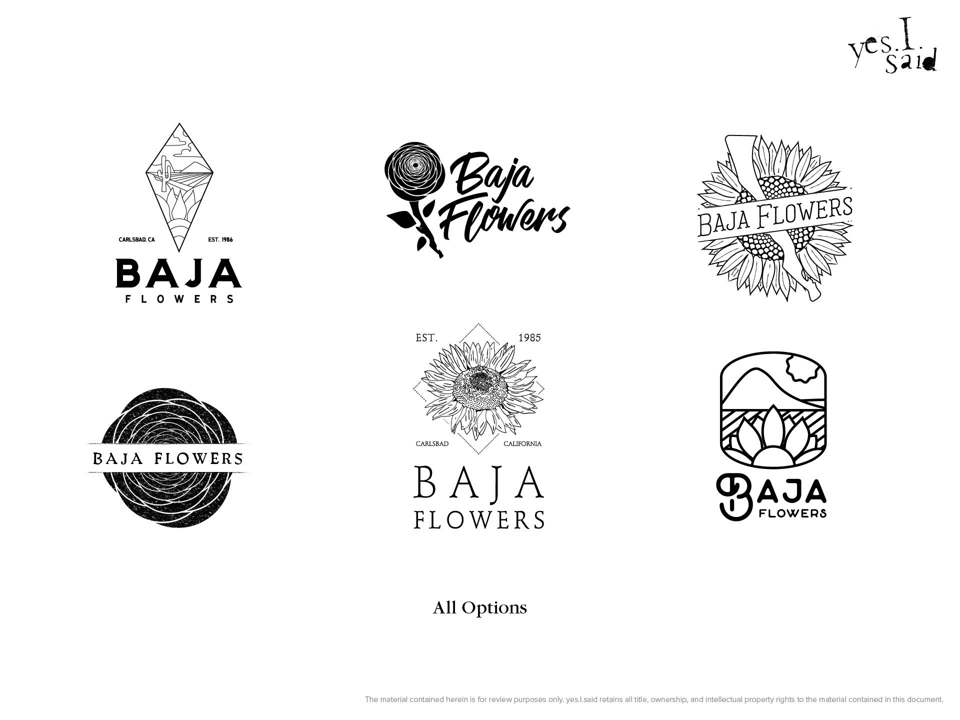
For the first step in the logo development process, I created a series of six logo ideas in black and white. My contact at Bandy would select three of those logos to be given the treatment in round #2. The initial six ideas play with different versions of depicting or mentioning the Baja Peninsula (including some that omit the reference entirely), different interpretations of ‘nostalgic,’ ‘classic,’ and ‘outdoorsy’ through font choice and illustration style, and — of course — sunflowers.
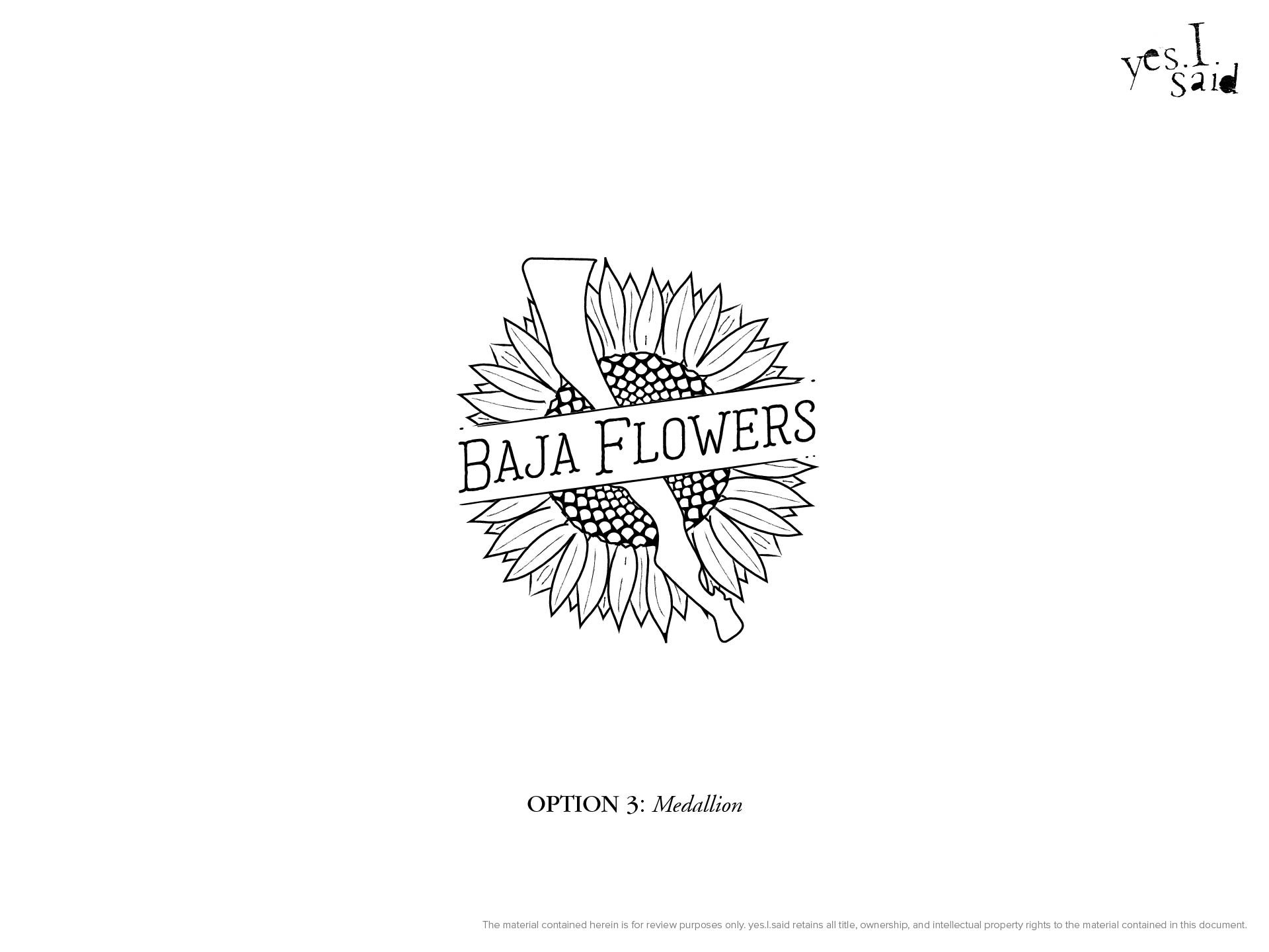
The winners were Option 1: Seed Packet, Option 3: Medallion, and Option 6: Monoline.
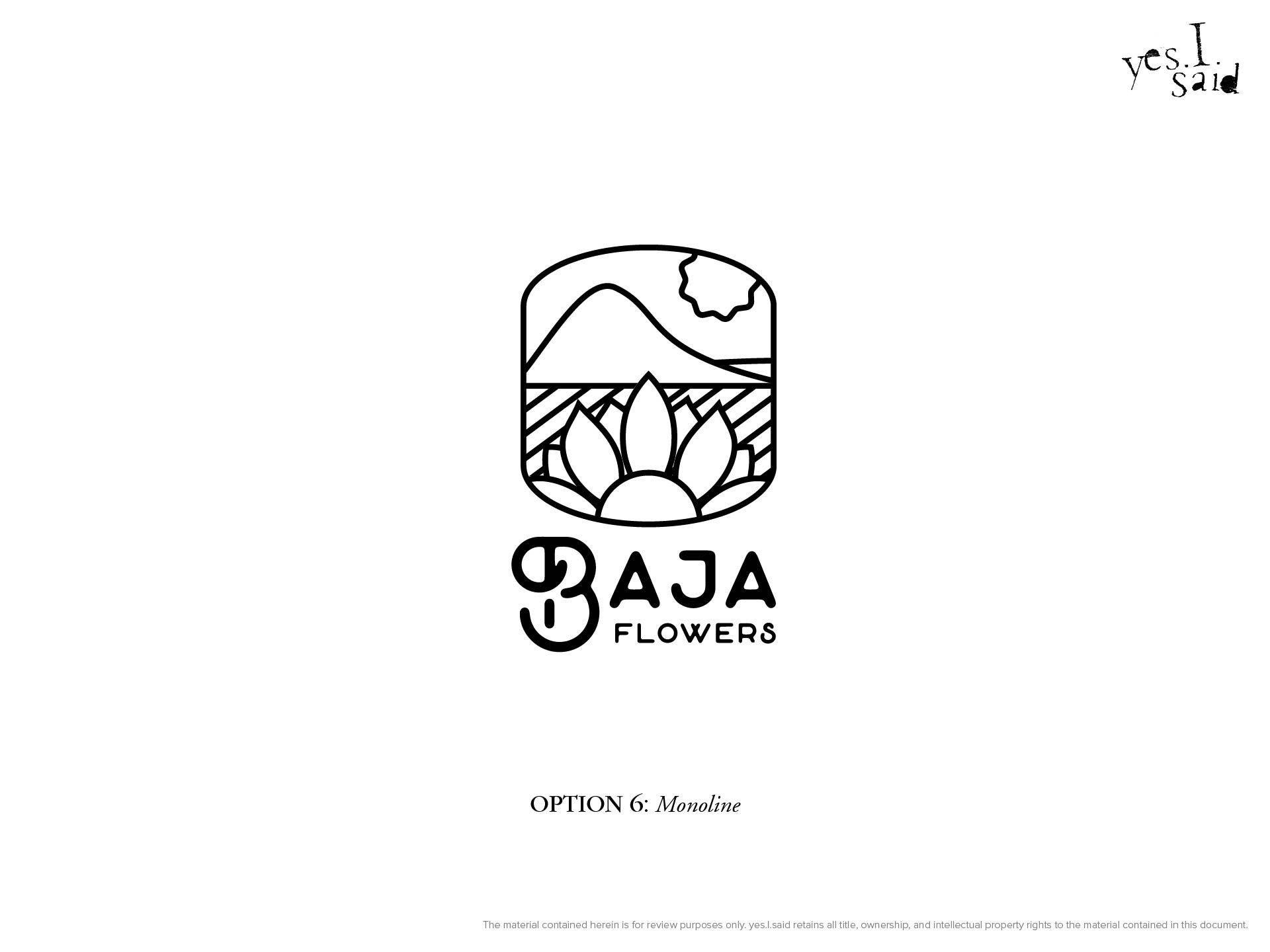
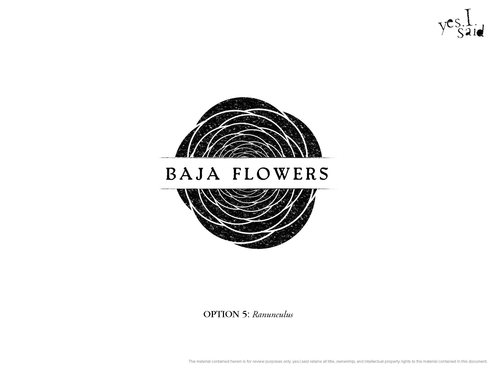
Logo Process: 2nd Round
For the second round of the design process, I developed the three ideas chosen from the first round, showing each in color, white on black, and black on white, and within a simple brand stylescape that incorporates an associated colorway and mockups of the logo on promotional and identity pieces.
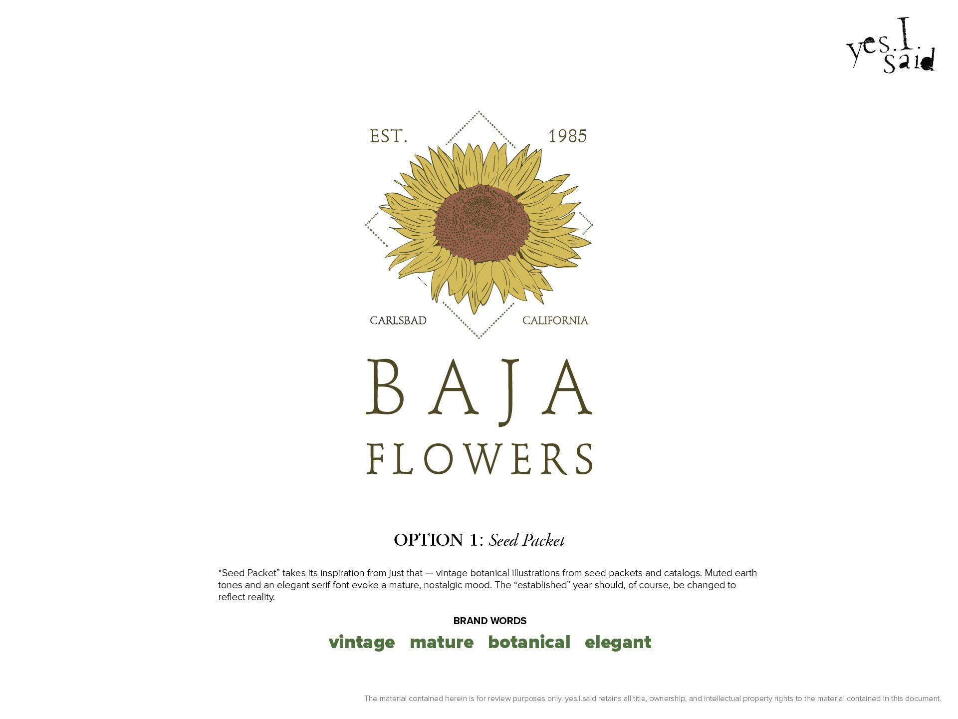
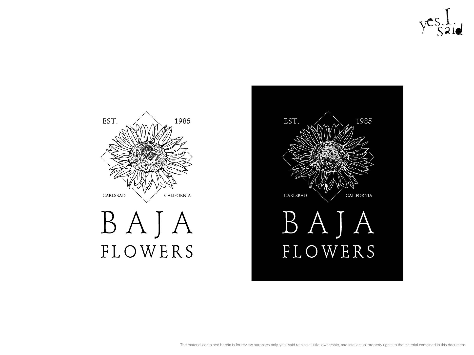
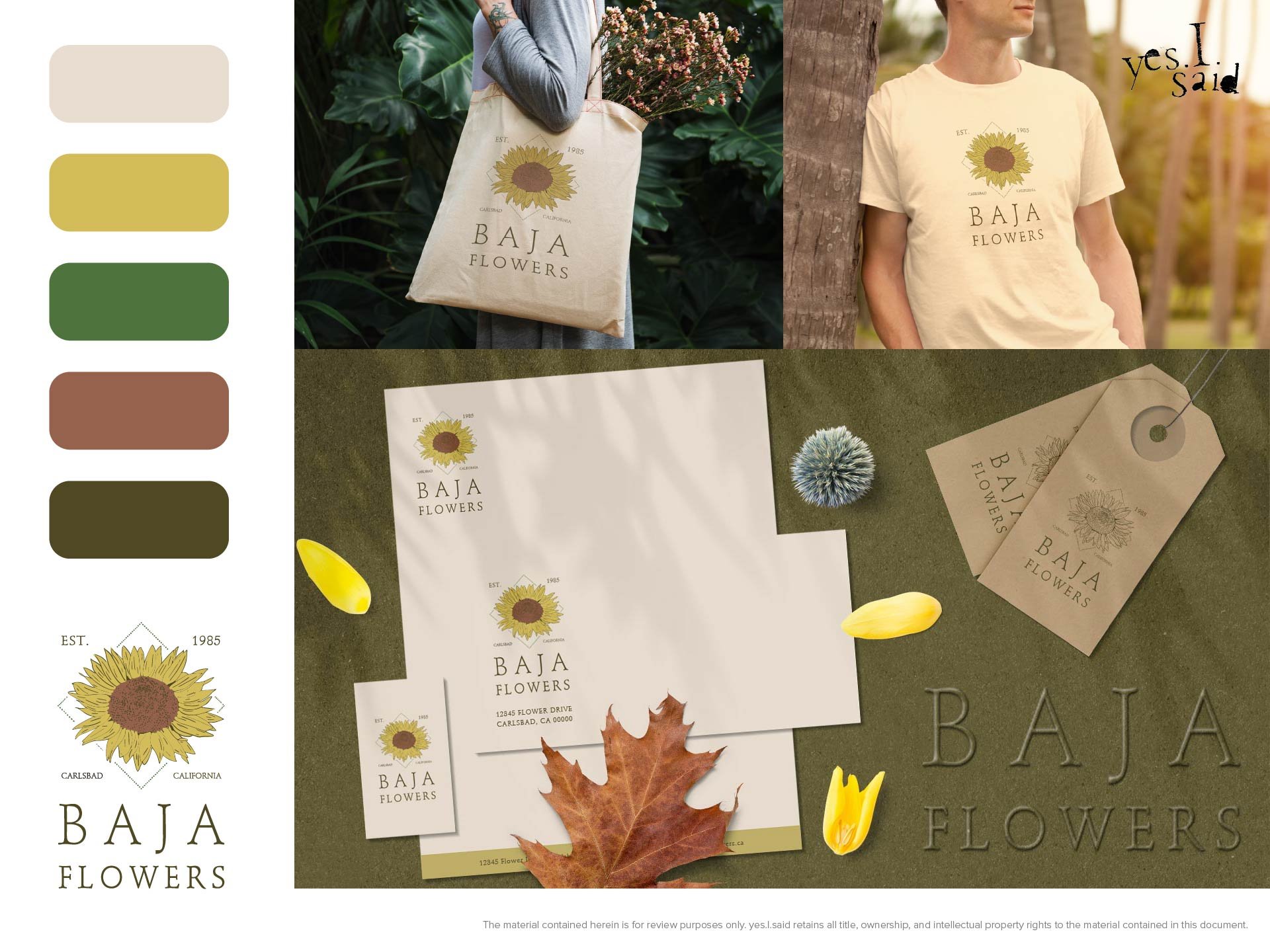
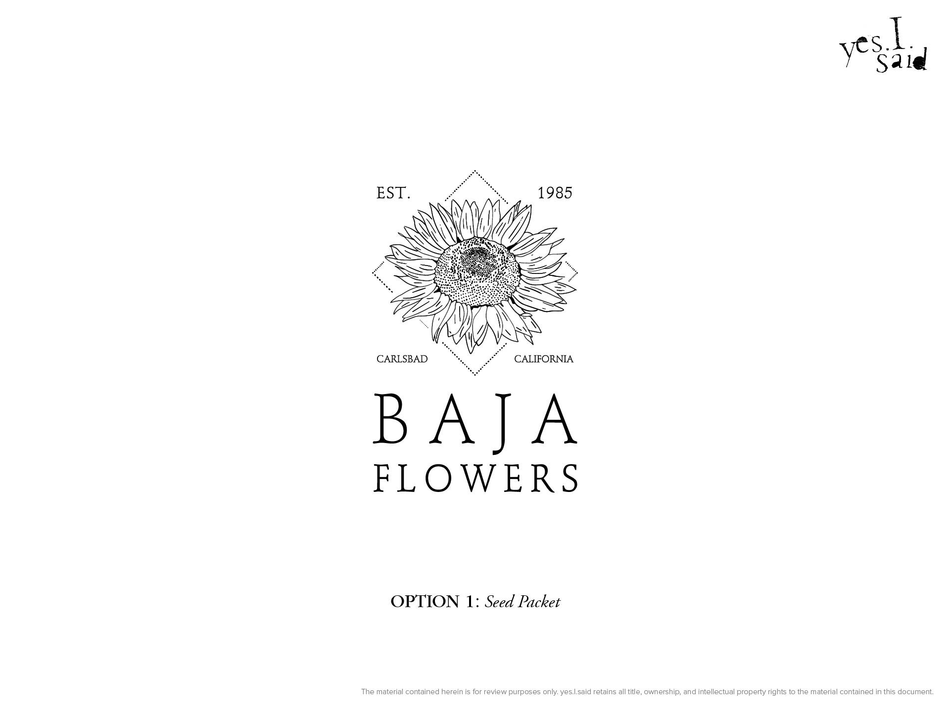
Option 1: Seed Packet
“Seed Packet” takes its inspiration from just that — vintage botanical illustrations from seed packets and catalogs. Muted earth tones and an elegant serif font evoke a mature, nostalgic mood.
BRAND WORDS: vintage, mature, botanical, elegant
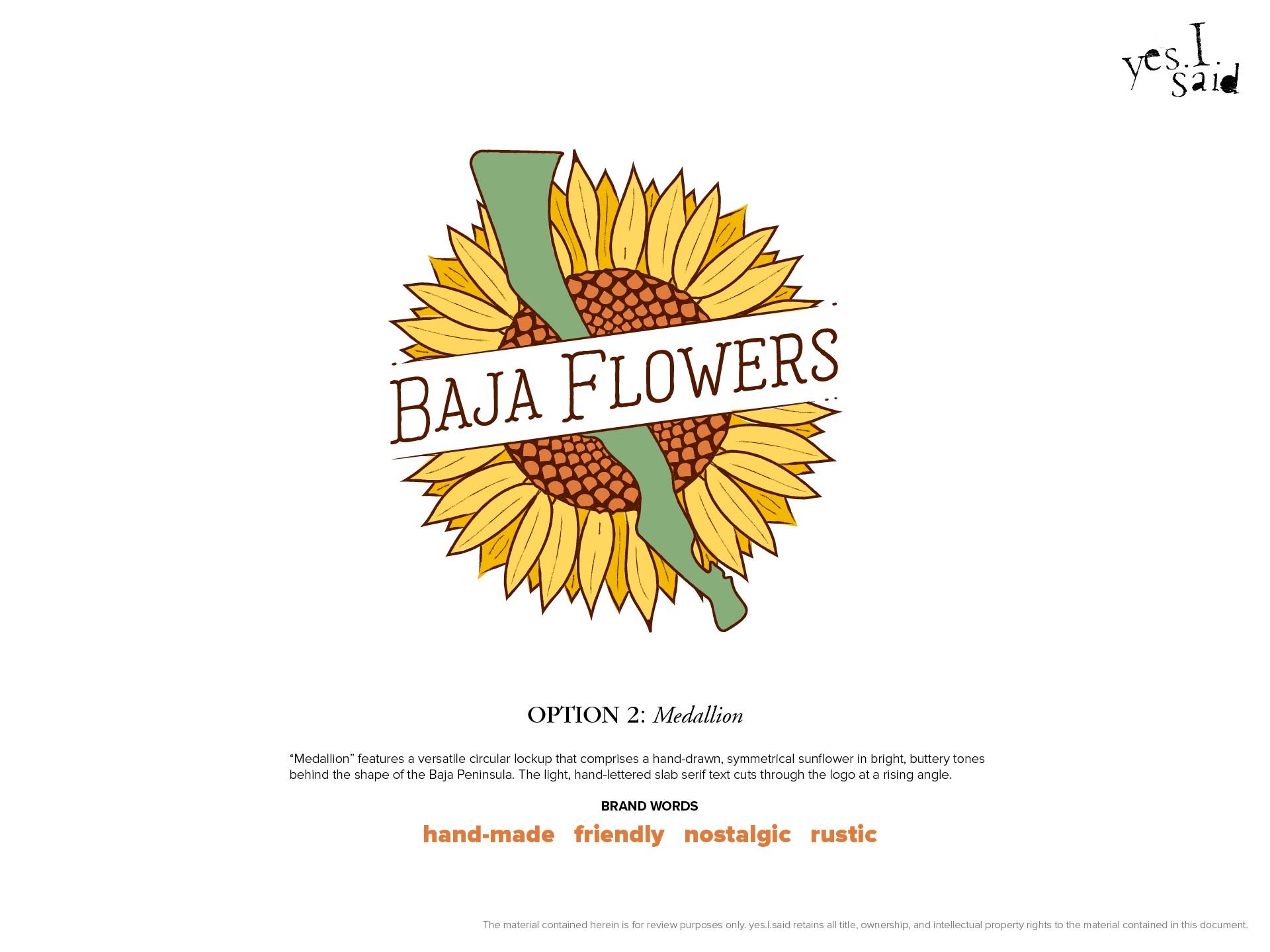
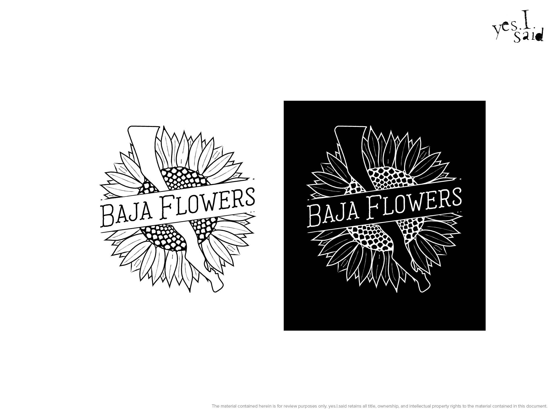
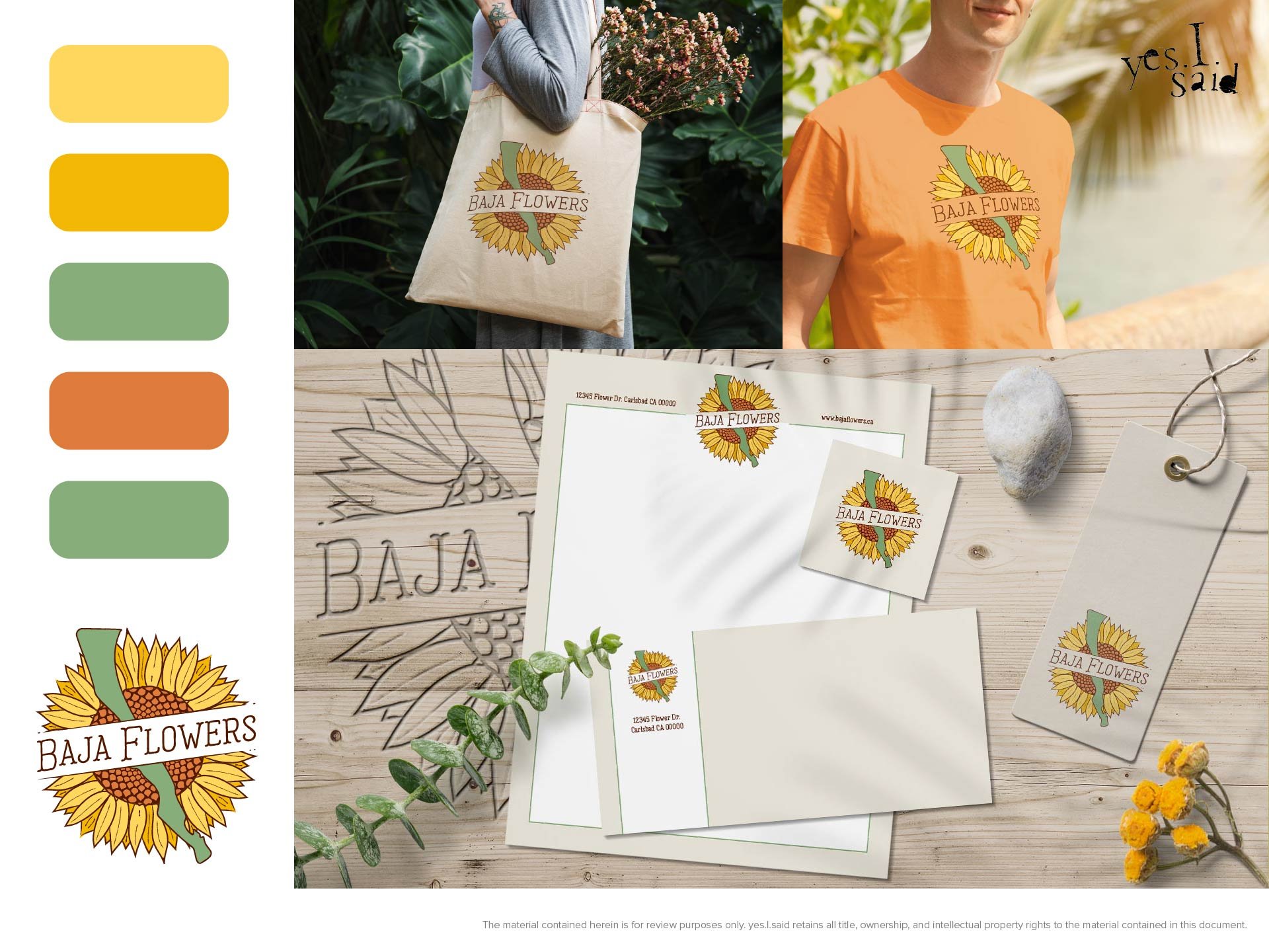
Option 2: Medallion
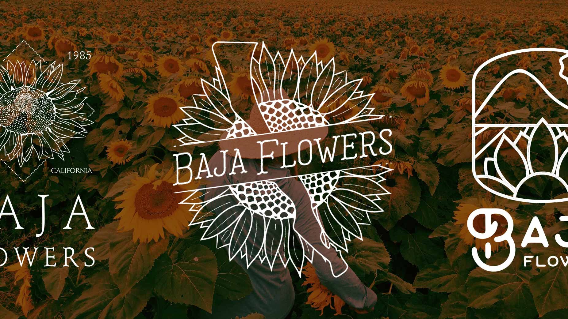
“Medallion” features a versatile circular lockup that comprises a hand-drawn, symmetrical sunflower in bright, buttery tones behind the shape of the Baja Peninsula. The light, hand-lettered slab serif text cuts through the logo at a rising angle.
BRAND WORDS: hand-made, friendly, nostalgic, rustic
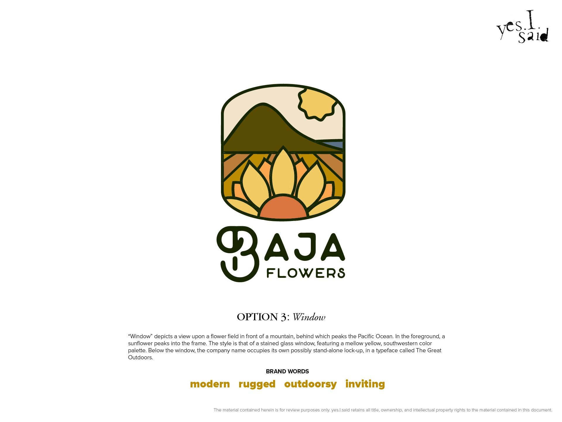
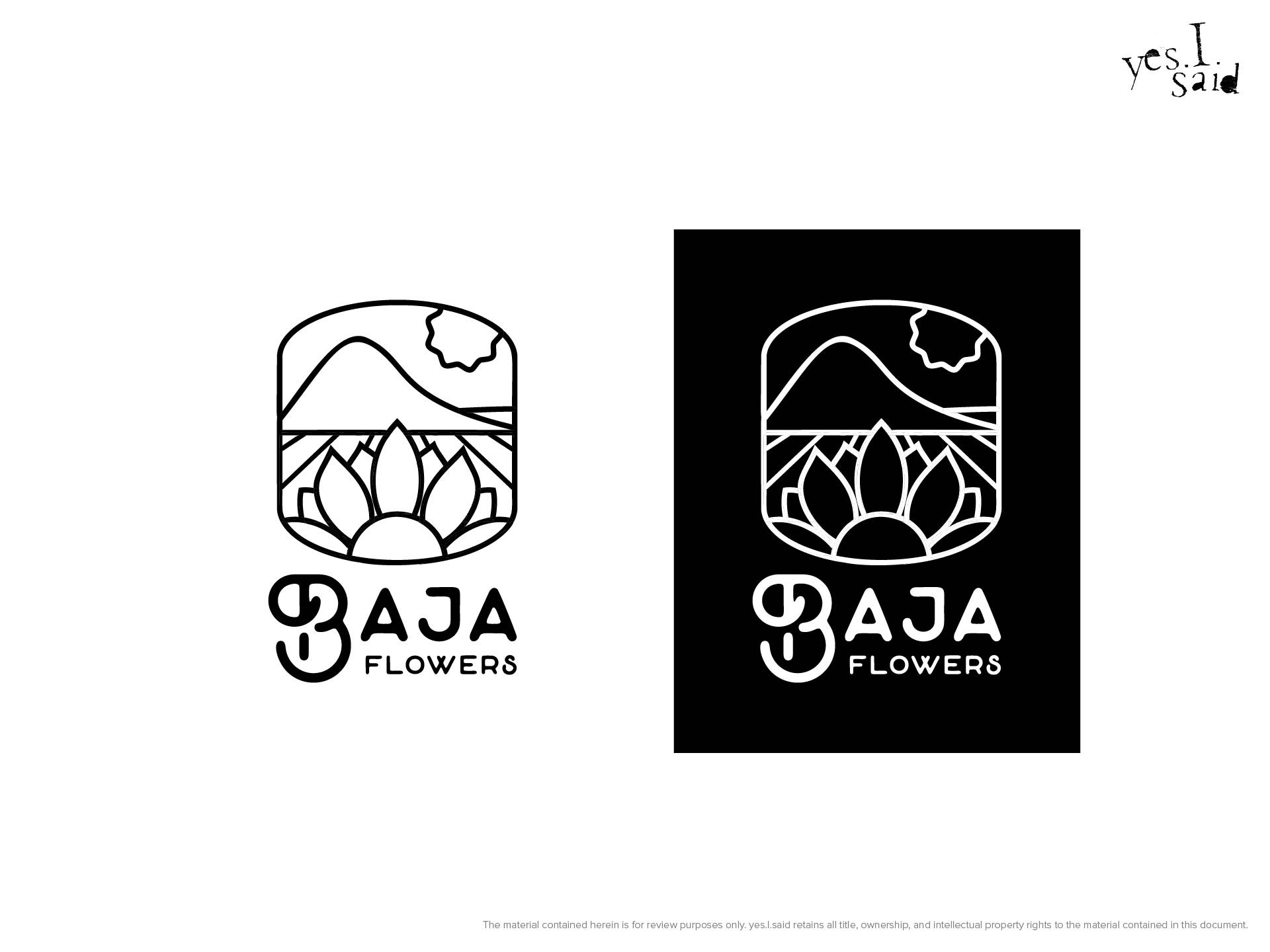
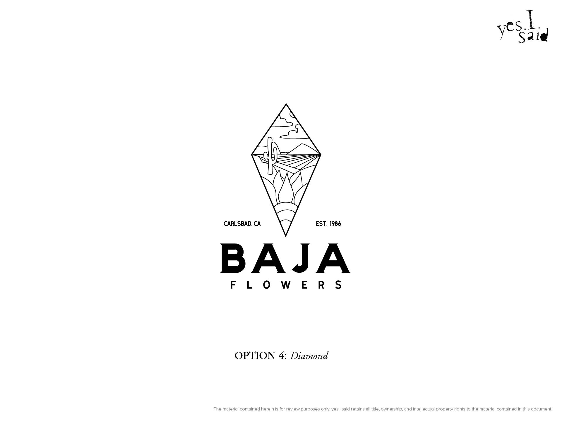
Option 3: Window
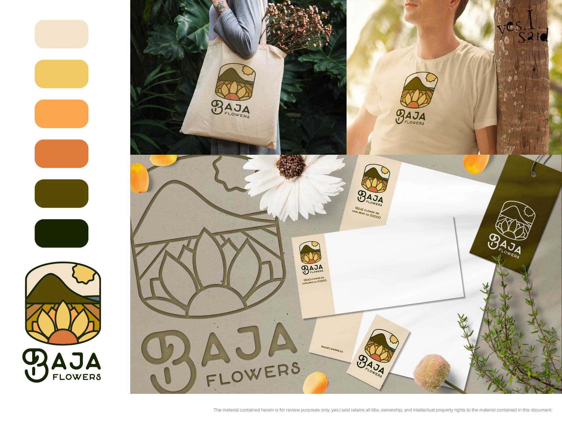
“Window” depicts a view upon a flower field in front of a mountain, behind which peaks the Pacific Ocean. In the foreground, a sunflower peaks into the frame. The style is that of a stained glass window, featuring a mellow yellow, southwestern color palette. Below the window, the company name occupies its own possibly stand-alone lock-up, in a typeface called The Great Outdoors.
BRAND WORDS: modern, rugged, outdoorsy, inviting
The Final Logo
And the winner is … Medallion! Normally, there might be another step in this process wherein I would have presented a few different variations of the selected logo, but the clients were happy with it as-is.
So far, I haven’t seen any evidence that the logo has been put to use — I’ll update this post if that situation changes.
Is your business in need of an identifying mark, visual brand strategy, or logo redesign? Contact me today for a free consultation and quote!