

CASE STUDY: Havrilla Designs
Shortly after the onset of the pandemic, things were looking uncertain for my longtime client Adam Havrilla of Artistic Blooms. An award-winning and sought-after floral designer and consultant, a large part of his projected income for the year was designing floral for weddings and events—most of which (understandably) had to be postponed or cancelled because of guidance prohibiting large gatherings of people in- or outdoors.
What to do when a pandemic threatens to decimate your business?
Do you save the money you have, or do you invest it in your business in order to adapt to the changing economy of your industry?
For a moment, Adam entertained the idea of becoming a brick-and-mortar operation, selling custom and seasonal bouquets and arrangements from his studio in Chicago’s Ravenswood neighborhood under the auspices of Artistic Blooms. After a trial sale at the studio, he realized that the customer service and retail aspects of this strategy did not play to his strengths, and went back to the drawing board to devise another solution.
Apart from his regular business of designing flowers for weddings and events, Adam consults for a number of wholesale flower distributors around the US (including yes.I.said client Bandy Ranch Floral). He decided to create a second DBA—Havrilla Designs—geared toward showcasing that work in order to grow that aspect of his career. He came to me to design the new identity, develops a website, and create a business card to support these efforts.
Step 1: Stylescapes
To begin, I designed two ‘stylescapes’ that represented directions the branding for Havrilla Designs could take. A stylescape is something like a mood board, but a few steps along, juxtaposing client-supplied imagery and preliminary design elements (color palettes, text styles, logos, stock photography, graphics, and web layouts) to give a broad sense of the entire feel of the brand design.
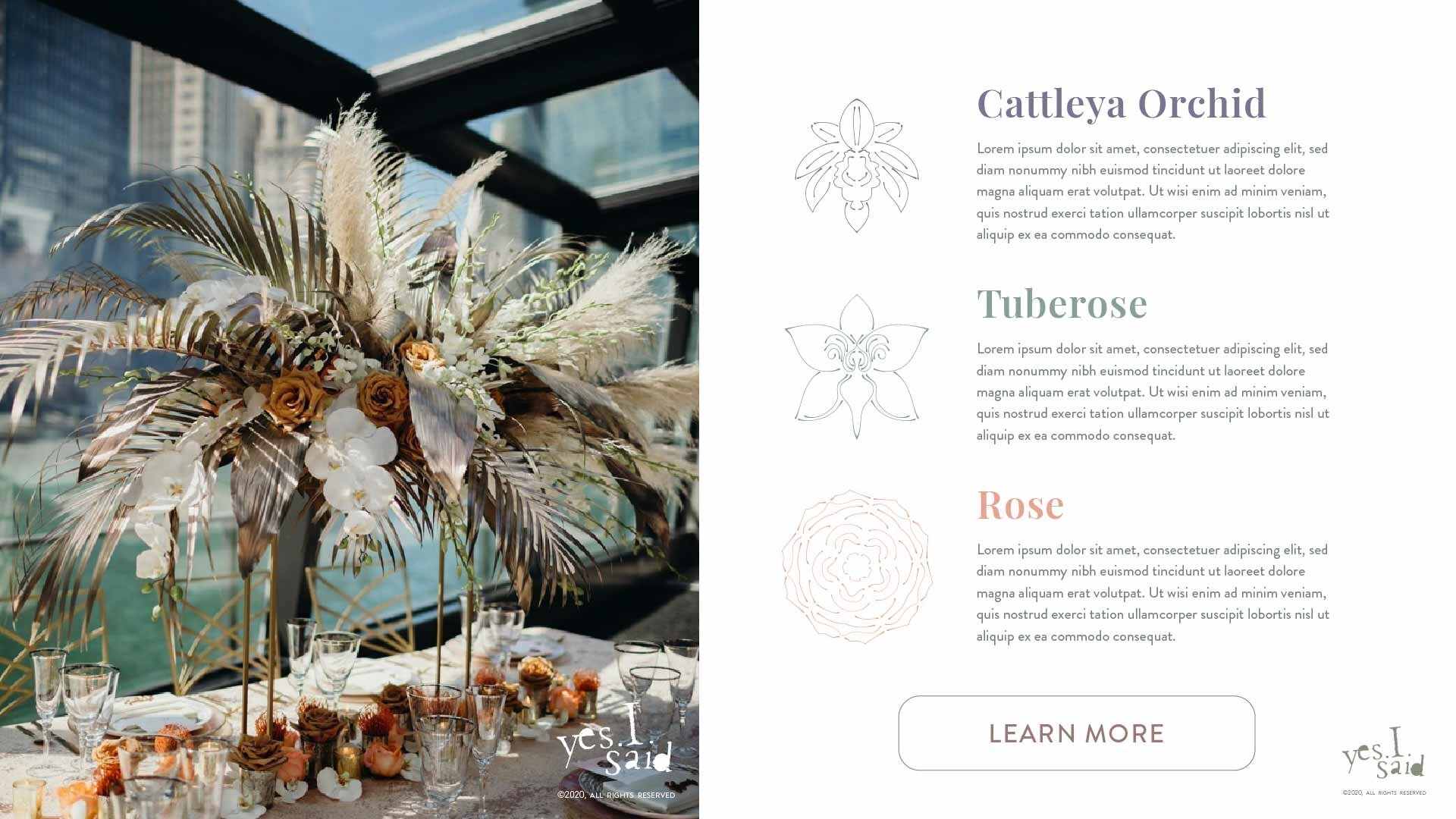
As a launching point, I asked Adam which flowers have the most sentimental, personal meaning for him. He named tuberoses, Cattleya orchids, magnolias, and roses.

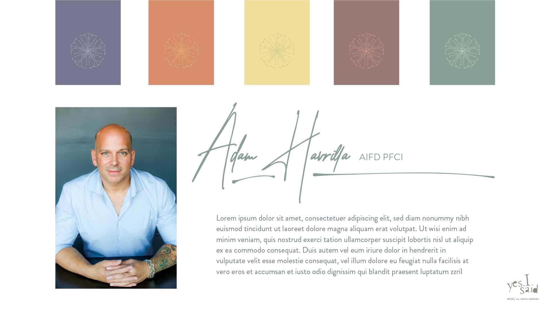
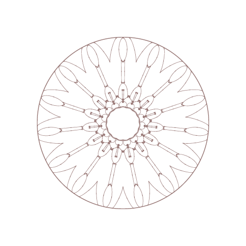
Stylescape #1: Magnolia
The Magnolia stylescape is a nod to trendy monoline artwork and identities, featuring a radially symmetrical representation of a magnolia for the logo, as well as ancillary illustrations. The colors are pairings of muted florals, usually in a dark/light pairing. The text treatments feature a serif/sans-serif duo of Brandon Grotesque and Playfair Display (both of which are easily accessible from Adobe and loaded in Squarespace). I knew Adam would like the clean, restrained, high-end look of this one.
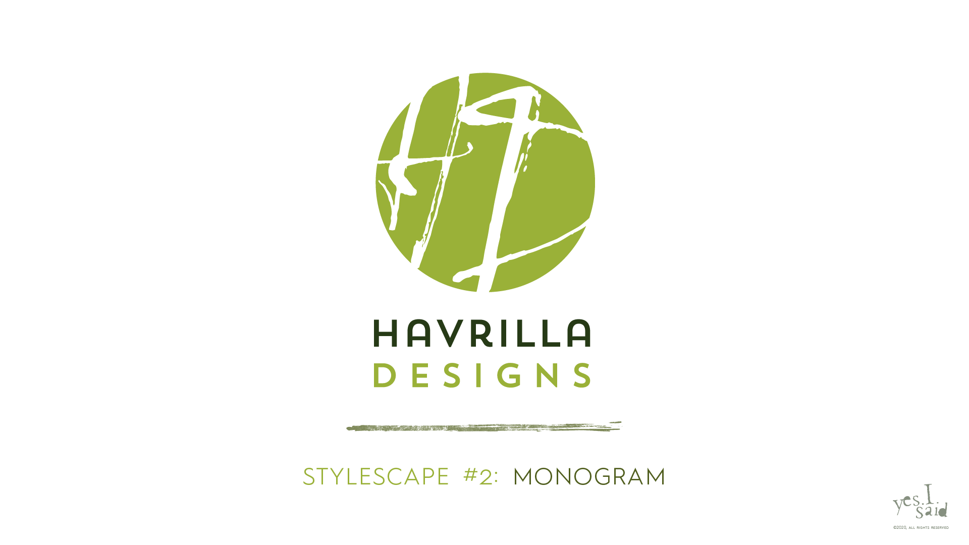


Stylescape #2: Monogram
I thought of the Monogram stylescape as a riff on/reference to the circular logo of Artistic Blooms. The colors are variations on greens and chartreuses extrapolated from a photo of one of Adam’s designs; I thought the green theme would serve as a nice backdrop to the pops of color in the floral photography—much as foliage is the backdrop to the blooms in a bouquet. The fonts in this one are Hurme Geometric Sans and Playfair Display (again), and the sans-serif/serif roles are switched from the Magnolia theme.
When I presented the stylescapes to Adam, he strongly favored Magnolia over Monogram, so that is the direction we pursued. Synchronistically, the Magnolia logo strongly resembles a tattoo Adam has on his own body, so it was kind of a no-brainer to pursue that direction.
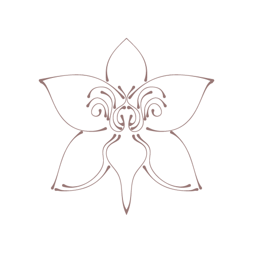
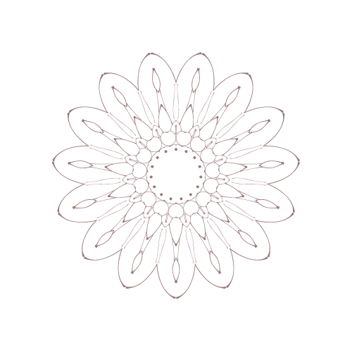
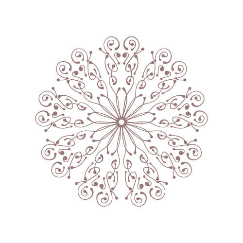
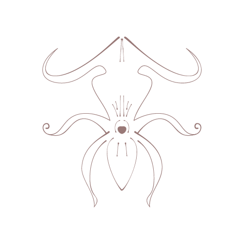
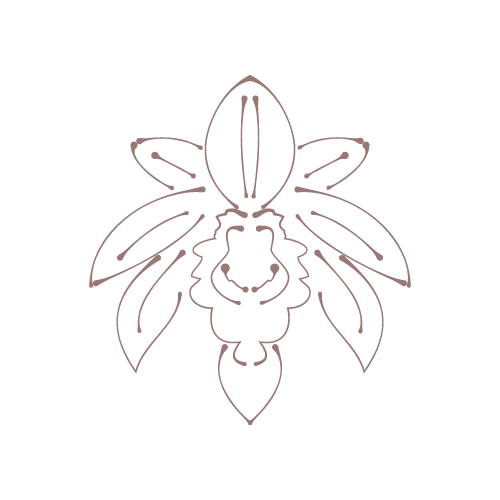
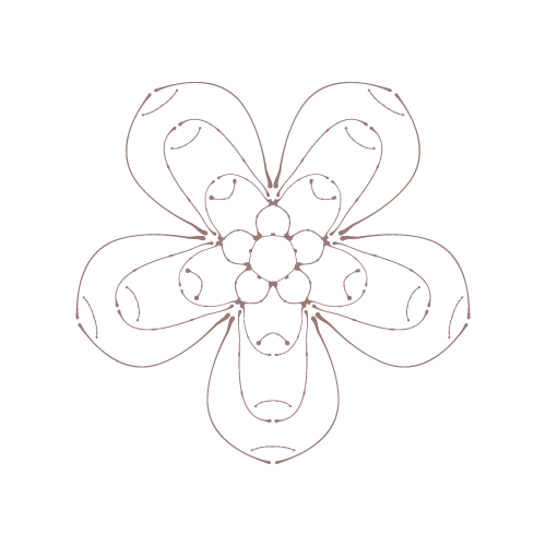
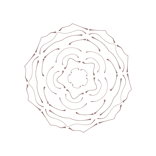
The Flower Illustrations
One of Adam’s requests as we moved forward was to create more floral illustrations inspired by other tattoos he has. This was a great opportunity to use my recently acquired pen tablet (XP-Pen Artist 15.6 Pro) and the beyond excellent suite of Illustrator plug-ins by Astute Graphics to create perfectly symmetrical representations of Adam’s favorite flowers and adaptations of his own tattoos.


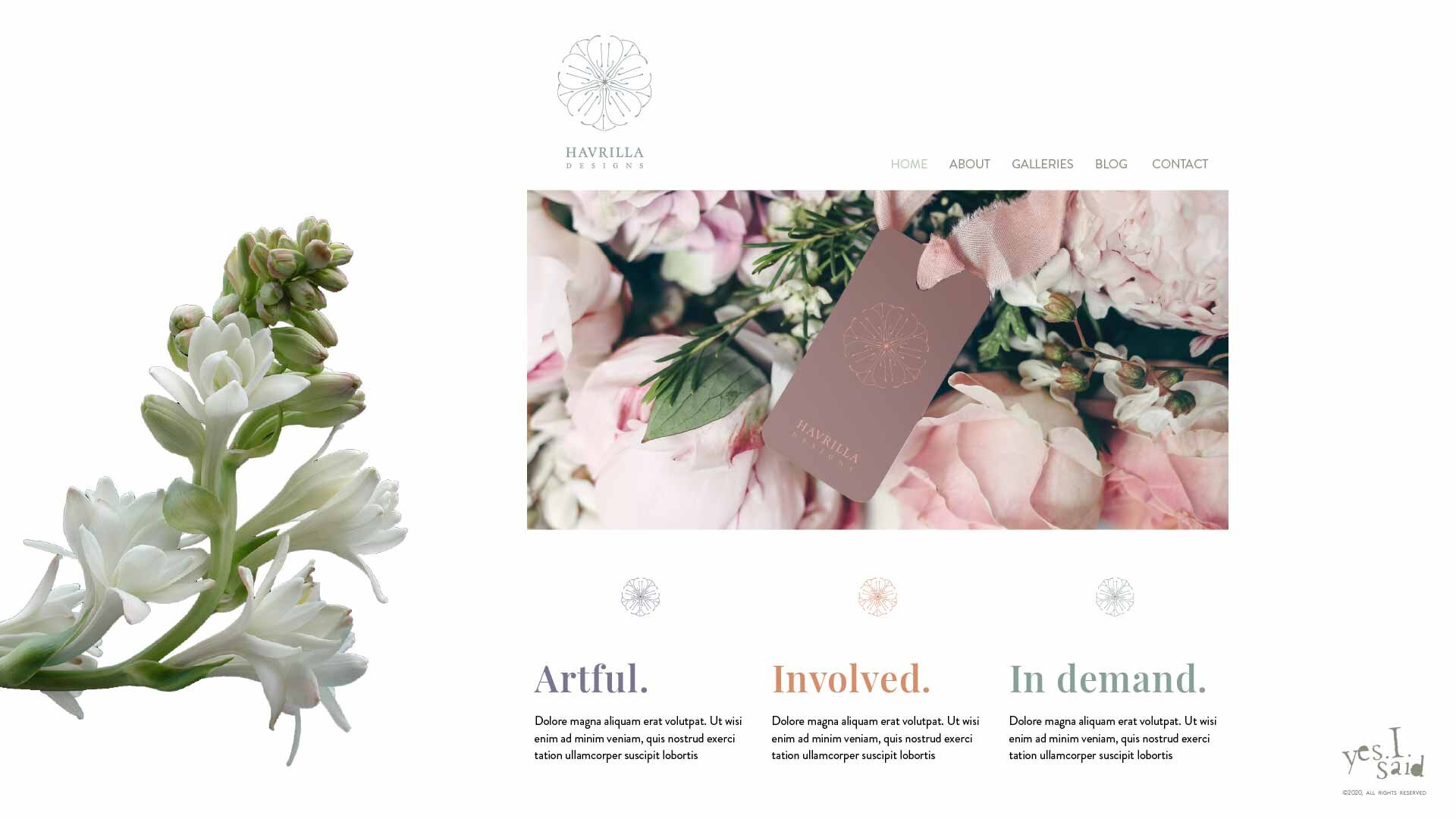
The Website
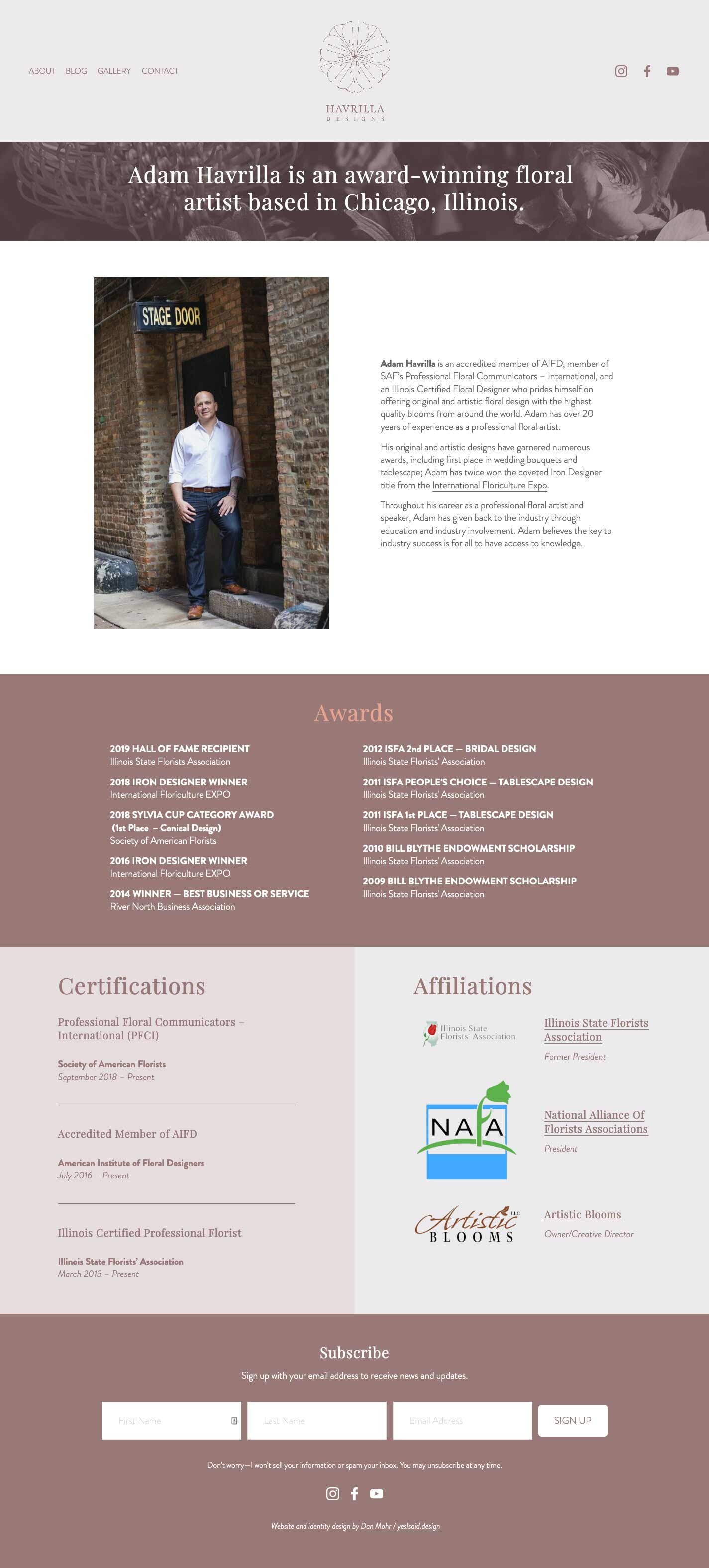
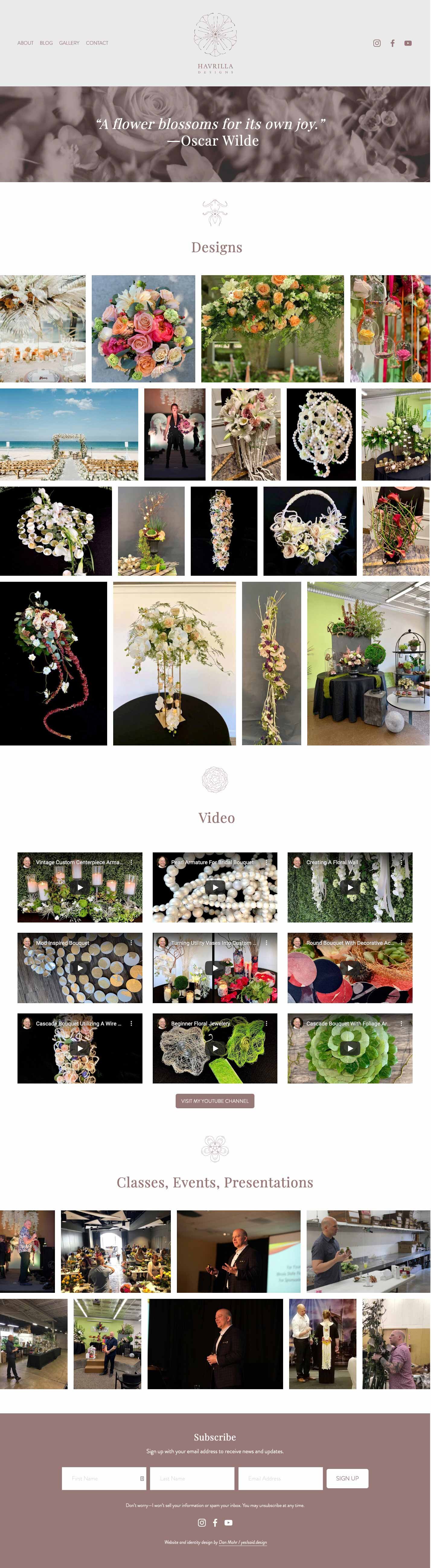
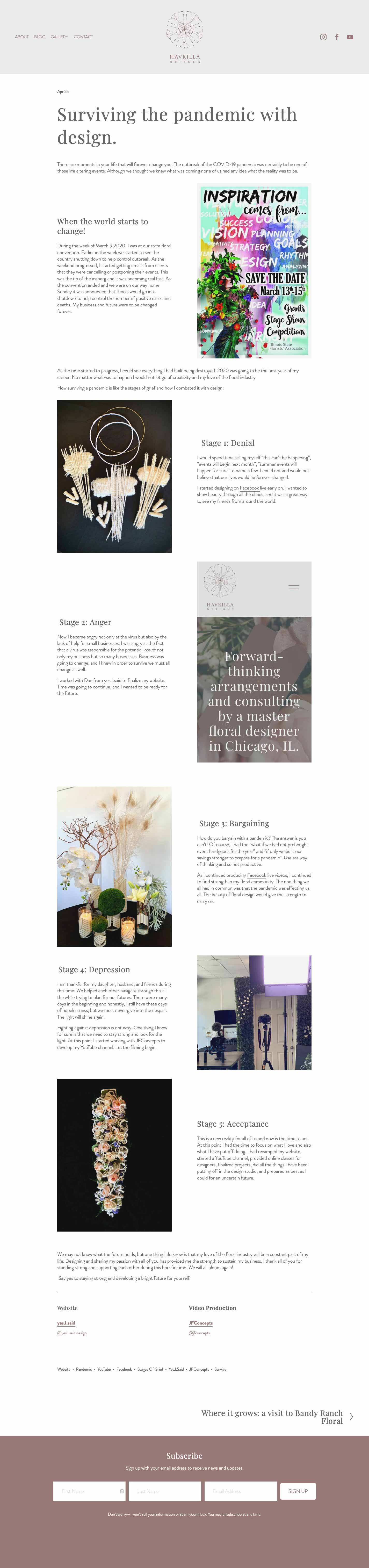
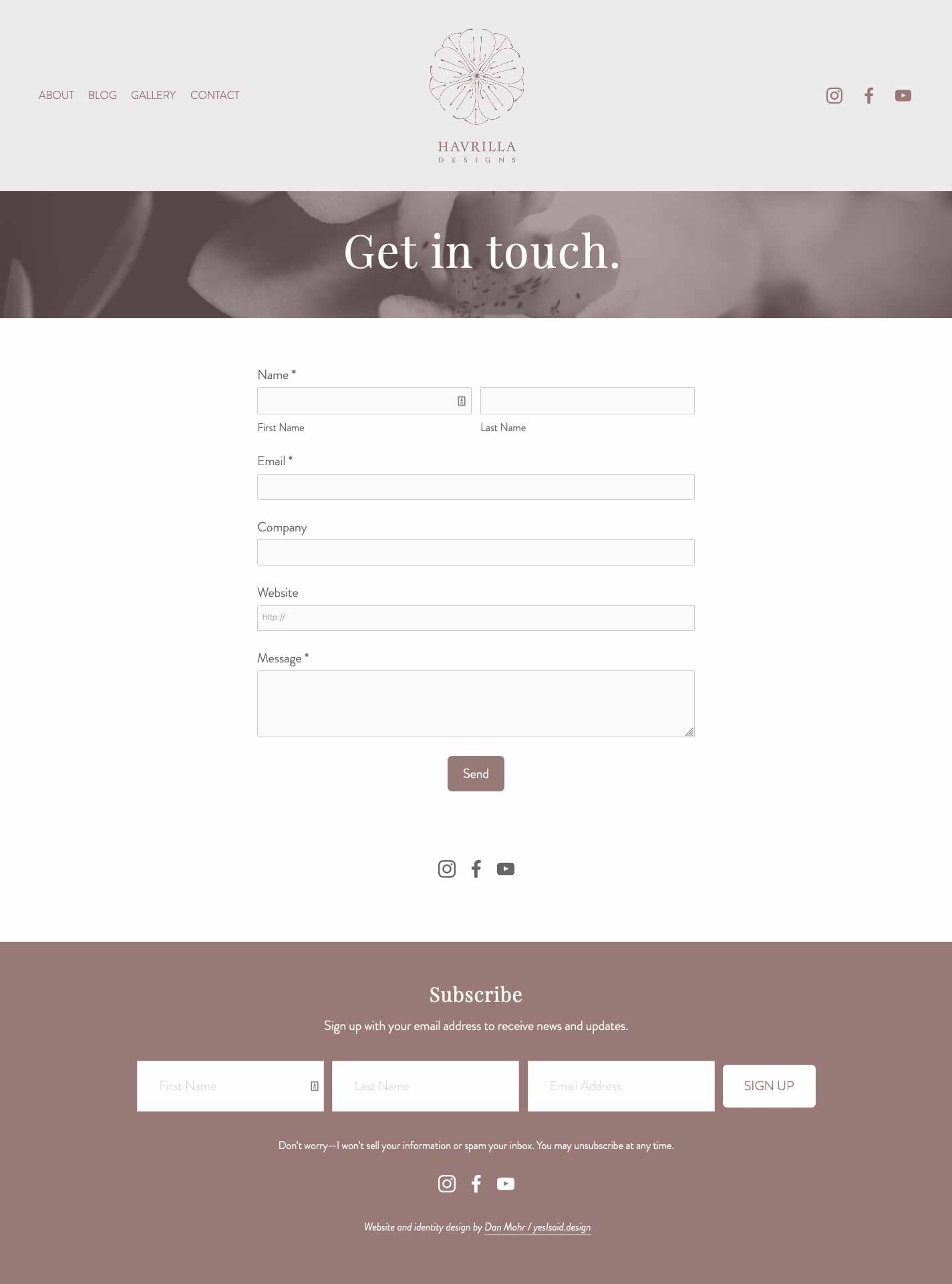
When Adam was considering his new website at the beginning of the year, before COVID, I advised that he keep the structure relatively simple and standard, with a well-populated homepage, an about page detailing his awards and achievements, a gallery showcasing his best work, a contact page, and a blog that would serve as a catch-all for event announcements, video releases, case studies, and how-to’s that he would update on a monthly or semi-monthly basis. The blog is also a great way to bolster SEO, incorporating more specialized search terms into the ecosystem of the site with every post. Adam did a great job putting together content for a a dozen or so posts that we could backdate and include when the site went live in late July. The other day, he posted a new account of his experience recalibrating his business model in the face of the pandemic—check it out here.
Since Adam explained that he wasn’t much of a ‘green’ person, I chose to go with the dusty rose/peach pairing from the stylescape as the primary color palette throughout the website. The site is minimal and clean, with a breakpoint that collapses the header for a more streamlined experience on medium to small screens. The flower illustrations appear as accents throughout the site.
Take a look at the screen caps below, or visit the site to get a sense of it.


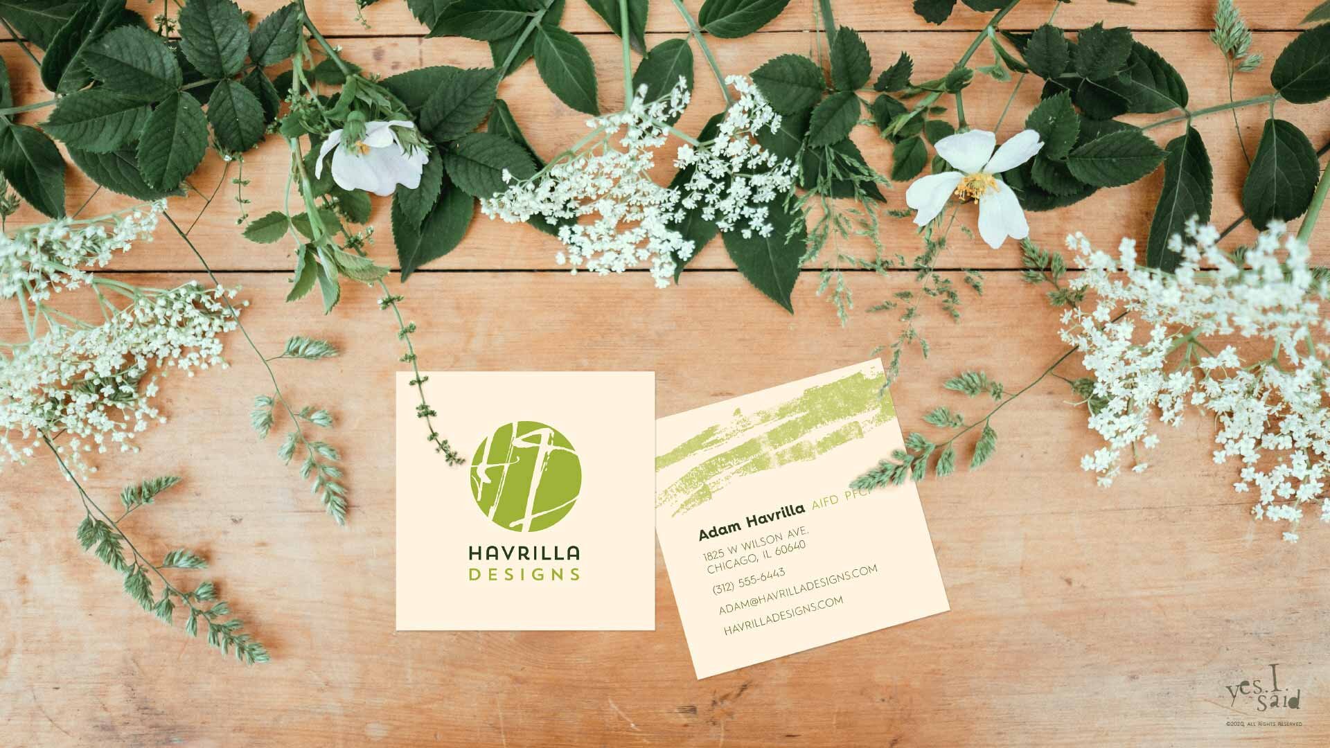
Business Card Design for a Florist
We went with a simple, vertical 2” x 3.5” business card, printed by my go-to trade printer. I chose a suede finished 16pt paper stock with the printer’s special raised UV gloss on the logo side to give them a luxe feel.
If your business needs any sort of design work done to help you weather the pandemic, don’t hesitate to contact yes.I.said today.